First impressions matter. Memorable brand experiences start with a strategically designed visual identity system. Graphic elements, color, and typography choices all work together to create an emotional connection that communicates your mission and unique personality.
For 30 years, the experiential design firm ZEBRADOG has created brand identity programs and naming strategies for organizations of all types. Here’s a round-up of recent clients in a wide range of industries including commercial real estate, media, non-profit, retail, and casual dining.
Launching a new brand, celebrating a corporate milestone, or need a refresh for your current identity? Explore ZEBRADOG’s Experiential Design Portfolio or contact us to get started.
Hank’s Burgers & Fish Fry | Casual Dining
![]()
Hank’s Burgers & Fish Fry is a takeout restaurant that was seeking an identity reminiscent of beloved burger joints from the 1970s – complete with bright orange and brown retro vibes and a script font. Lovingly named after their grumpy bulldog Hank, the dog mark is central to the identity. The unique badge shape that houses the mascot is a nod to the days when a fast-food restaurant launched with a sign that later became a logo.
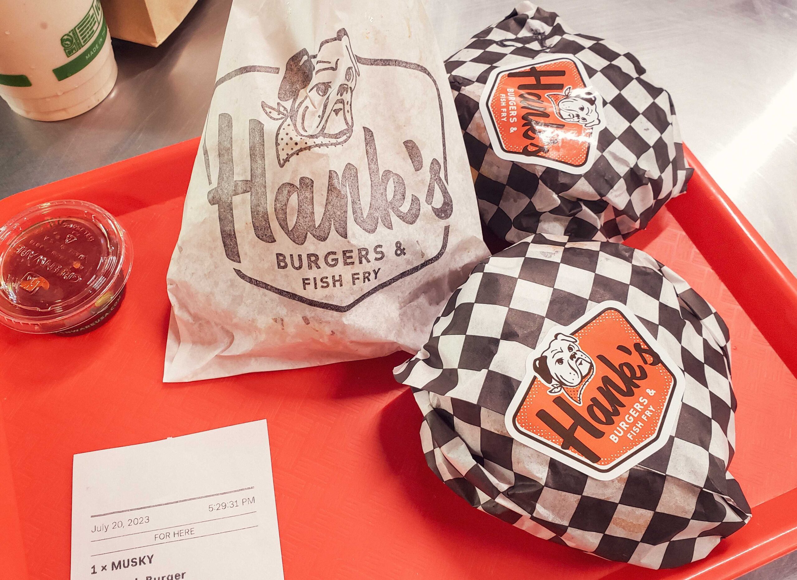
Hank’s is already a popular expansion for the owners of other higher-end dining concepts in Madison, Wisconsin. The identity is memorable and easy to use on a variety of packaging and sign types which will flex as business demands.
Jim Lemon Foundation | Non-Profit
![]()
Kate Lemon established the Jim Lemon Foundation as a charitable organization to honor her late husband Jim’s memory. Jim was a tremendous golfer and an even better husband, friend, and father. The foundation’s mission is to give the next family facing a cancer diagnosis more time by fundraising for the prevention, research, treatment, and cures of all types of cancer.
The family’s unique last name and love of golf come together to create a memorable, meaningful identity that is a tribute to the legacy Jim left behind. The tagline “savoring every second” extends the lemon motif while paying off the mission in a heartfelt way. The foundation actively hosts fundraising golf tournaments throughout the season and this new identity provides the organization with a variety of logo uses on and off the course.
Duet by Jazzman | Retail
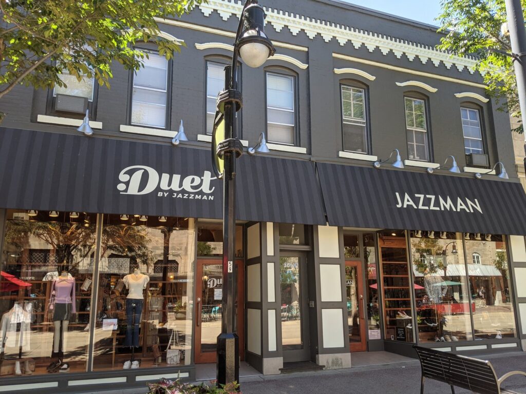
Jazzman has been a Wisconsin retail destination for over 47 years. Primarily known for men’s clothing ranging from timeless essentials to bold and funky, the owners approached ZEBRADOG to help them expand into a new neighboring location featuring women’s apparel.
![]()
The name Duet complements the Jazzman brand. The logo mark features the music symbol for repeat, a clever nod to the store’s expansion. The color choices, typography, and design elements are inspired by the jazz records of the 50s and 60s that were exploding with incredible new ways to showcase type and graphics. And like a good jazz riff, the identity has playful iterations to allow for the full word mark or a stacked version giving the store options for its marketing, signage, and promotions.
ByUs | Media Organization
![]()
ByUs Media is a cutting-edge content production company dedicated to empowering college athletes and showcasing their stories. Their mission is to redefine the narrative surrounding college sports and deliver compelling content to a national audience.
The identity needed to be approachable, recognizable, and convey credibility as a trusted media resource in a crowded landscape of bigger, more established sports content brands. It had to strike an energizing chord with its Gen Z audience and have the flexibility to be used in a variety of college athletic environments. The resulting script, color choices, and aesthetic delivered strike a fresh, authentic, humanizing chord for the ByUs brand to shine through in a variety of digital platforms and physical promotional applications.
Velocity Station | Commercial Real Estate
![]()
SARA Investment Real Estate is a commercial real estate investment firm with an uncompromising commitment to the highest standards of service and integrity. Since its inception, SARA has successfully cultivated a portfolio of quality retail, office, industrial, and mixed-use investment properties throughout the Midwest.
A new opportunity for laboratory and commercial office space required a name that emphasized its prominent location off Madison’s Beltline Highway while capturing the speed of business in a modern environment. Velocity Station embodies this energetic hub for growth, transformation, and innovation. Graphic elements reflect this kinetic energy and rapid movement. The tagline “speed of innovation heart of Madison” underscores all the identity elements to further differentiate this new space from other commercial real estate in the area.
Launching a new brand, celebrating a corporate milestone, or need a refresh for your current identity? Explore ZEBRADOG’s Experiential Design Portfolio or contact us to get started.
Brand Identity
Embrace Milestones to Advance Your Brand Identity
Brand anniversary logos are an effective way to convey the reliability, trustworthiness, and stability that come with longevity. Learn about ZEBRADOG’s approach.
MORE